
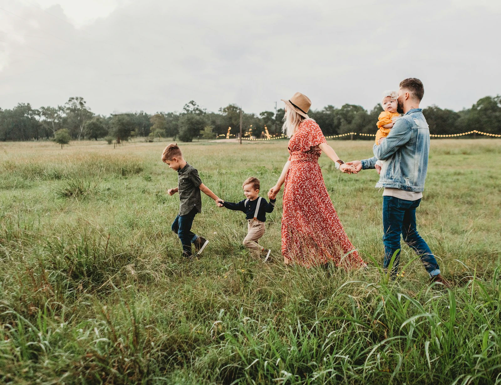
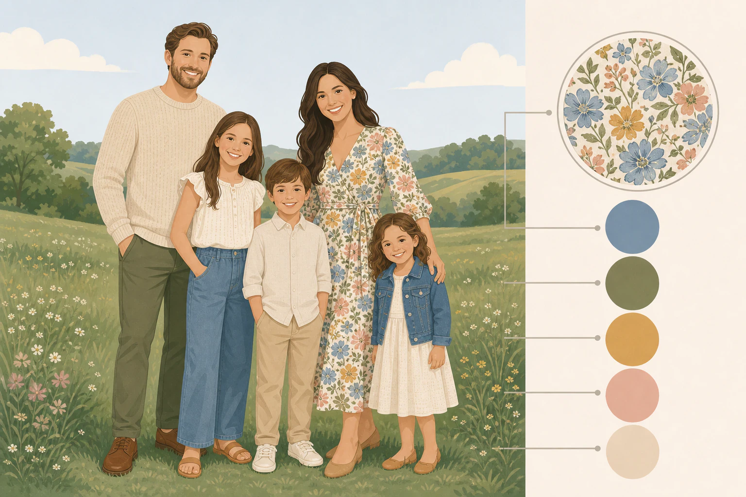
Coordinate a small palette, don't put everyone in the same shirt.
You booked the golden hour slot, bribed everyone into the car, and then the four-year-old climbed in wearing a neon dinosaur shirt that's going to throw a faint lime tint onto his sister's cheek in every frame. That's the actual thing to solve. The fix isn't sticking the whole family in matching white polos and jeans, which reads more like a company retreat than a family. Pick three or four colors that sit well together, spread them across everyone so nobody's an exact twin, mix in some texture and a little light and dark, and check the whole thing against wherever you're shooting. Do that and the clothes disappear and the faces do the work, which is the entire point.
Start with one outfit, then let it pull the rest.
Coordinating a group from scratch is where people freeze. The shortcut is to not start from scratch. Anchor the whole family to one piece and lift the other colors out of it.

- Pick the anchor outfit first. Usually it's the busiest or most patterned piece, often a dress someone already loves. Lay it down and pull three or four colors out of it. If mom's in a sage dress with rust flowers, your palette is sage, rust, and a couple of neutrals to fill in around them.
- Give the colors jobs. One dominant shade that shows up the most (navy, olive, burgundy), one or two supporting tones (cream, tan, gray), and one small accent (mustard, blush, teal) that appears in a scarf or a pair of shoes, not on a whole person.
- Spread it around, don't uniform it. Nobody has to wear every color, and nobody should wear only the accent. Aim for a nice balance so the eye travels across the group instead of clocking two people in identical shirts.
- Vary the depth. Put some light and some dark in the mix. If everyone lands in the same medium tone, faces and bodies blur together and the photo goes flat. A little contrast separates people from each other and from the background.
- Hold it up to the location. Before anything's final, picture the palette against where you're standing. A green field, a white beach, and a wood-paneled living room each want different colors, which is the next section.
Four families that almost never let you down.
Neutrals
Cream, tan, beige, gray, charcoal, khaki, and denim. This is the failsafe base, and denim counts as a neutral, not a color. Neutrals coordinate with almost anything and they age well, so a print you hang for ten years won't look stuck in a specific season.
Earth tones
Olive, mustard, rust, terracotta, and warm browns. These sit beautifully in fall foliage and in-home sessions with wood and warm light. They read cozy without going loud, and they photograph richer than they look on the hanger.
Jewel tones
Navy, emerald, burgundy, plum, and teal. If you want real color without a bright shirt hijacking the frame, this is it. Jewel tones are saturated but deep, so they add punch and hold up especially well in winter and against darker backdrops.
Soft pastels
Blush, sage, dusty blue, lavender, and pale peach. Best in spring and against light, airy backdrops. They keep things gentle and cohesive, just add one slightly deeper tone somewhere so the group doesn't wash out into one pale cloud.
Matching is great until it isn't. Coordinated beats identical in every single frame.
The stuff that quietly wrecks an otherwise good shot.
Steer clear of neon and highly saturated brights, especially bright red, orange, and hot pink. It isn't a style opinion, it's physics: those colors bounce light back up and cast a tint onto whoever's wearing them and the people next to them, so one person's face ends up a different color than everyone else's. There's a quick test for it. Hold the shirt up under your chin in bright, natural light and look in a mirror. If you can see the color reflecting onto your skin, it'll show up in the photo too.
Big logos, cartoon characters, and graphic tees are the other common miss. They pull the eye straight off faces, and they date a photo faster than anything, because the logo that's everywhere this year looks like a time stamp in five. Same reasoning applies to anything hyper-trendy: if you'll cringe at it in a decade, leave it out of the print you're hanging in the hallway. And watch the two failure modes at the ends of the palette, an all-white family melting into a white wall or a snowy field, and an all-neutral group blending straight into beach sand. Both need one person carrying a bit of color to anchor the frame.
The right color depends on where you're standing.
A palette that sings in a studio can vanish in a forest. Match the clothes to the setting, not just to each other.
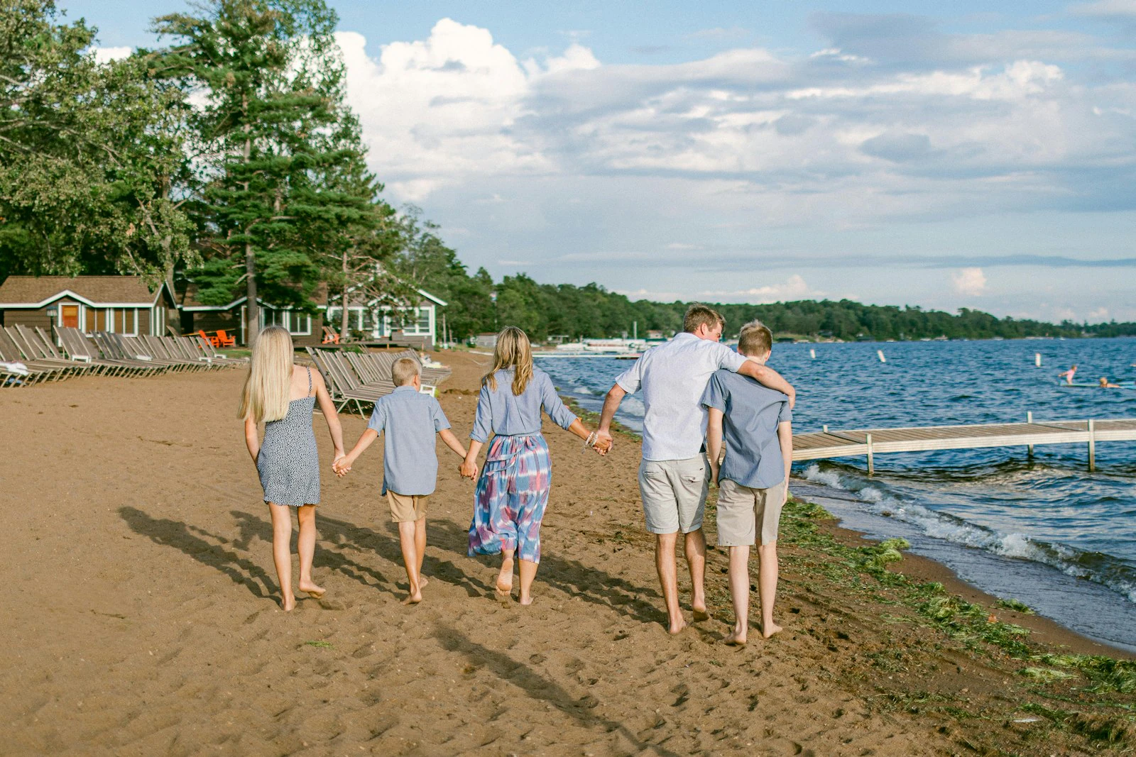
- Green fields and trees. Skip the greens and olives here or you'll blend into the background. Warm tones do the opposite: blush, rust, and cream pop cleanly against all that green.
- Beach and open sand. Whites, tans, and soft blues feel right and keep it airy, but toss in one slightly deeper tone so the group doesn't disappear into the light sand.
- In-home sessions. Earth tones and plenty of texture play well with wood, warm bulbs, and cozy rooms. Nod to your own decor too, since these are the photos most likely to hang on those same walls.
- Fall foliage. Two ways to win: dark, bold colors that stand out against amber leaves, or earth tones that settle warmly into them. Both work, just pick one direction.
- Snow and bright scenes. When the world's washed out, be the color that draws the eye. Jewel tones and deep neutrals read strong against white; head-to-toe pale reads like a ghost.
Palettes that fit the time of year.
A rough starting point, not a rulebook. Shift it to match your family and your location.
| Season | Palette that works | Why |
|---|---|---|
| Spring | Blush, sage, dusty blue, cream, pale peach | Soft tones echo new green and blossom without competing with it |
| Summer | White, tan, light blue, muted coral, soft yellow | Light and breezy for beaches and bright evenings; keep brights muted |
| Fall | Mustard, rust, olive, burgundy, warm brown | Earth tones melt into foliage; a deep jewel tone pops against it |
| Winter | Emerald, navy, plum, cream, charcoal, ruby | Deep, rich colors hold up against bare trees, snow, and holiday scenes |
Where interest comes from without the chaos.
Patterns are fine in small doses and a disaster in large ones. The workable rule is one statement pattern per group, and roughly two solid outfits for every patterned one. Put a bold floral dress on one person, build the rest of the family in solids that pull colors out of it, and you've got a focal point instead of a fight. Multiple clashing patterns, a stripe next to a plaid next to a leopard print, gives the eye nowhere to rest and makes even a great expression hard to see. Keep patterns medium-sized too, since very tiny tight patterns can shimmer and buzz on camera and very large ones tend to swallow small kids.
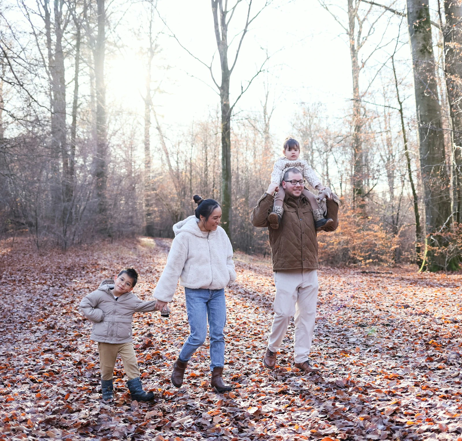
Texture is the safer way to add depth, and it's underused. A chunky knit sweater, a corduroy jacket, a linen shirt, a cardigan, a bit of lace, denim against wool: those read as richness in a photo without any of the risk a busy print carries. Layers pull double duty, adding that visual interest and giving you options if the weather turns or a kid melts down. A jacket that comes off, a scarf that goes on, a vest over a shirt, all of it gives the photographer more looks from one outfit.
Small things that save the session.
- Comfort wins with kids, every time. An itchy sweater, stiff shoes, or an outfit that's too warm and the mood is gone before the first frame. Let them move. A child who can run around is a child who'll actually smile.
- Don't forget the shoes. They show more than you'd think, especially when people sit or the shot goes wide. Bright sneakers under a coordinated palette are a classic accidental distraction. Closed-toe and in-palette is the safe call.
- Dress one notch up from everyday. Not black-tie, just a step above the t-shirt and leggings you'd wear to the store. Iron things, and check for stains and stray threads the night before, not in the parking lot.
- Use accessories to fill gaps. Hats, scarves, a watch, simple earrings, and a belt let you thread the accent color through without dressing anyone head to toe in it. Keep them small so they don't compete with faces.
- Lay it all out a week early. Every outfit, on the bed or the floor, seen together. That's when you catch the two people who accidentally matched, the missing layer, or the shirt that needs a wash. Bring a backup for the kids.
Once the outfits are sorted, the rest shouldn't be a hassle.
Here's the version of this that goes smoothly: a good photographer sends you a short style guide like this one before the shoot, you book the slot and pay the deposit from a single link without a back-and-forth of texts and invoices, and a week or two later the gallery lands in your inbox where you can pick favorites and order prints without anyone hard-selling you. That whole experience is the photographer's job to build, and it's worth choosing someone who's set it up well.
If you're the photographer reading this to send to your own clients, that smooth path is exactly what tools like PicurPhoto handle: a booking page on your own domain, payments through your own Stripe account so deposits and refunds stay yours, and password-protected galleries that upsell prints for you. There's a genuine free tier to start, with ten galleries and a gig of storage, and because it's a flat subscription PicurPhoto never takes a cut of your bookings, so every deposit lands in your account in full. When you outgrow the free tier there's a $19 a month plan that adds a custom domain and drops the branding. The styling is on your clients. The booking, paying, and gallery part is on you, and that part doesn't have to be clunky.
What colors should you avoid wearing for family photos?
Neon and highly saturated brights, especially bright red, orange, and hot pink, because they reflect color onto skin and tint faces unevenly. Also skip big logos, cartoon characters, and graphic tees, which pull the eye off faces and date the photo. And avoid an all-white group against a white or snowy background, where everyone blends in.
Should family outfits match for photos?
No. Coordinate instead of match. Matching everyone in the same shirt and jeans reads stiff and uniform. Pick a palette of three or four colors, spread them across the family so people complement each other, and vary the shades. The goal is a group that clearly goes together, not a group in identical clothes.
How many colors should a family wear in one photo?
Three to four is the sweet spot. Think of one dominant color, one or two supporting tones, and a small accent that shows up in a scarf or shoes. Fewer than three can feel flat, and more than four starts to look busy and uncoordinated.
What should mom wear for family photos?
Often the easiest move is to build the whole palette around mom's outfit, since a dress with a bit of pattern or color makes a natural anchor. A flowy dress in a flattering tone photographs well and gives you three or four colors to pull the rest of the family from. Comfort and something you feel good in matter more than any specific color.
What should you wear for fall family photos?
Earth tones are the go-to: mustard, rust, olive, burgundy, and warm brown settle beautifully into autumn foliage. If you'd rather stand out than blend in, a deep jewel tone like emerald or navy pops against amber leaves. Add texture with knits and layers, which suit the season and the cooler weather.
Is it okay to wear jeans in family photos?
Yes. Denim behaves like a neutral and coordinates with almost any palette, which is why it's a family-photo staple. Just keep them clean and in good shape, skip heavy rips and loud washes, and dress the tops a notch above everyday so the overall look still feels intentional.
Shooting families and tired of the booking mess?
If you're the photographer, set up a free booking page, take deposits through your own Stripe, and deliver galleries that sell prints for you. See if it fits before you pay anything.